Selling the City in Lights

After a settlement between the City of Cleveland and Clear Channel Outdoor (as a result of the City unconstitutionally banned billboards advertising alcohol), the two may reach an agreement to allow six downtown billboards/murals/displays and one new billboard at Hopkins International Airport. Read the PD's story here.
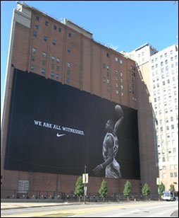
Currently, Cleveland ordinance restricts the issuance of permits for billboards Downtown. As the Code states, "Billboards shall not be permitted in Cleveland Landmark Districts, Public Land Protective Districts, Business Revitalization Districts or on the opposite side of any street bordering such districts" (much of Downtown is described under the 'Public Land Protective District' designation). However, most recently, permit was issued to install Nike's LeBron James banner on the arena-facing wall of the Medical Arts Building (within the Protective District) and in the last few years Playhouse Square has added to its collection of electronic tickers, television displays and Broadway signs and lights. Similarly, lighted logos have been placed at the tops of downtown high-rises, the most notable addition a red key at the top of Key Bank's downtown headquarters, the tallest building in Ohio.

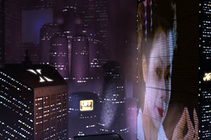
The addition of six new LeBron-sized banners, murals or digital displays and the precedent set for more to follow will have a significant (and exciting) impact on the appearance of Downtown Cleveland. Years of zoning codes and regulations have restricted advertising and signage to an unfortunate extreme, such that the Charter would lead you to believe Cleveland should be mistaken for Burnham's White City. Why discourage the use of ad signs and lights at the confluence of thousands of downtown workers and huge entertainment and nightlife crowds - the region's center for commerce, culture and entertainment?
The existence of zoning restrictions, however, positions Cleveland at an advantage for the placement of these new ads - only under Council's careful control will signs be placed and designed (preventing the standard highway billboard from making an appearance). Their likely additions at Playhouse Square and in the other downtown business and entertainment districts will certainly enhance the liveliness of the city and take a further step against the excessively-deliberate planning and zoning regulations and continue to encourage a more finely textured, organically changing downtown character. And of course, as an admitted product of the culture of consumerism, I rather enjoy the lights of Broadway, Shanghai's Pepsi (Nanjing) Road and Cleveland's LeBron (remember the Browns' Brian Sipe on the side of a since-destroyed Warehouse District building?). If the habits and traditions of a consumer society has as significant an influence over our lives, shouldn't the shape the cities we live in have the ability to reflect this character? Is much of the slow resurgence of this City and similarly plagued rust-belt cities a result of an inflexible form (outdated regulations, policies and attitudes) that struggles to adjust to a changed society?
Note: If you find yourself just as fascinated with the 'archaeology' of signs and ghost ads check out Cleveland SGS. This Flickr site contains nearly 900 photos of signs, advertising and ghost signs from around the city.

1 Comments:
Great article. Definitely deserves further discussion (or maybe a 'Part II' to the billboard post)... the possibility that this "economic aesthetic" is changing cities (while we are unawares), and the way buildings' image is valued by fashionable (and increasingly mainstream) clients may change the way architects should approach design.
A thought... as the list of 'starchitects' designing 'signature' retail, restaurants and condominiums in cities has become increasingly trendy, the tradition of these typologies built in the vernacular may be changing - the result of this new urban landscape could become much like the advertising landscapes of today... a garish collection of designs created to be louder and brighter than one another, instead appear uniform and unnoticed as it becomes more dense.
Post a Comment
<< Home